C语言-求三角形面积
本文共 301 字,大约阅读时间需要 1 分钟。
一、代码
//三角形面积:(海伦公式)(p=(a+b+c)/2)//S=sqrt[p(p-a)(p-b)(p-c)]#include#include void main(){ double a,b,c; double p; double s; scanf("%lf%lf%lf",&a,&b,&c); if((a+b>c)&&(a+c>b)&&(b+c>a)){ p=(a+b+c)/2; s=sqrt(p*(p-a)*(p-b)*(p-c)); printf("%lf",s); } else printf("无法构成三角形"); }
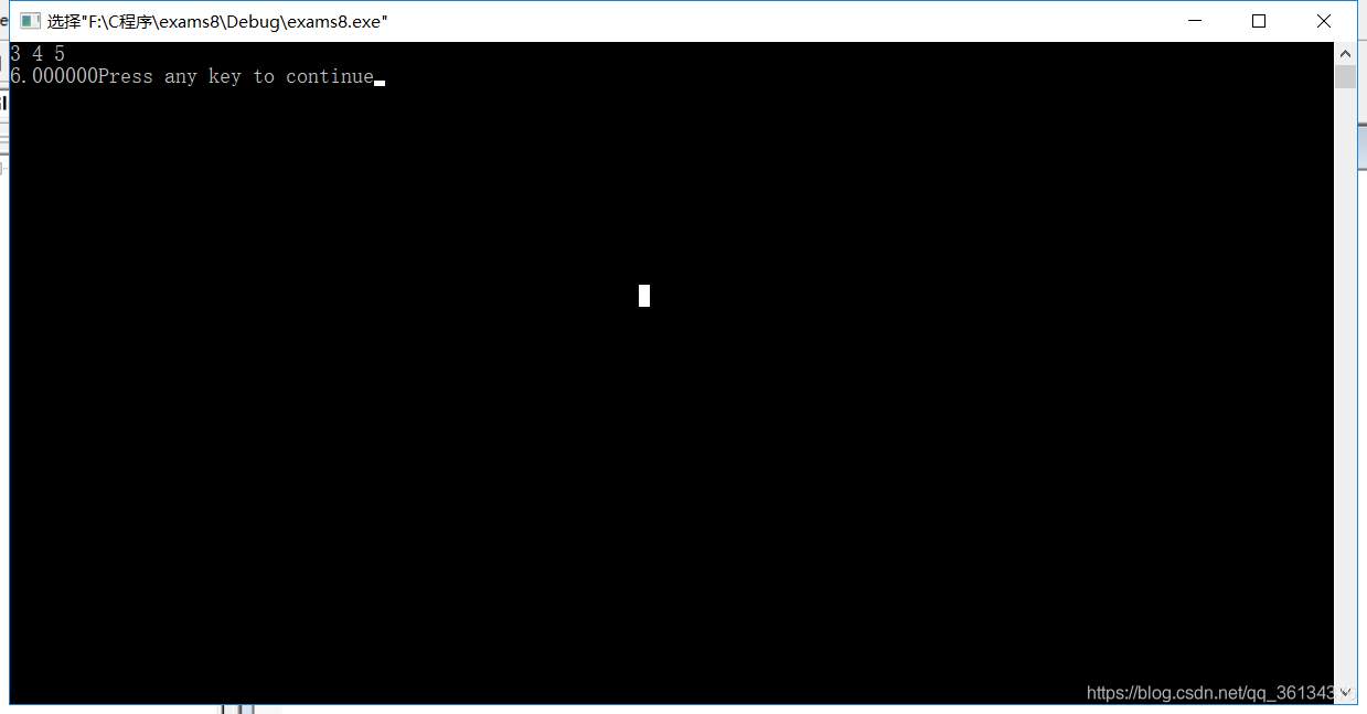
二、结果
转载地址:http://xbch.baihongyu.com/
你可能感兴趣的文章